Getting started
Item setup
Catalog management
Seller Fulfillment Services
Listing optimization
Order management
Taxes & payments
Policies & standards
Growth opportunities
Advertising
Walmart Fulfillment Services (WFS)


Analytics Dashboard Overview
The Delivery Dashboard
Client Center shows analytics about delivery performance for one, multiple, or all Pickup Points. There are two reports available on the dashboard: the Driver Wait Time Report and the Metrics Summary Report. All data in Analytics shows up in the time zone of the Pickup Point(s) selected. Let's break down each section in the dashboard.
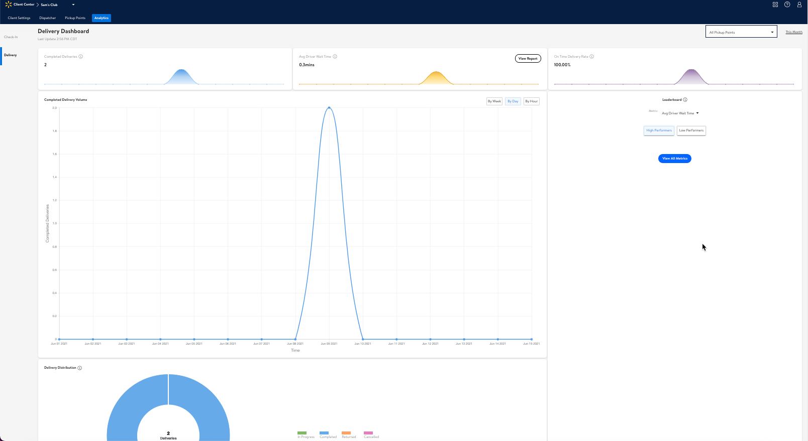
Completed Deliveries
You can view completed deliveries for one or all Pickup Points within a specified date range here. A "delivery" refers to the trip our driver makes from a Pickup Point to a customer's location to drop off an order. A single order may require one or multiple deliveries depending on its composition (the type of items and total number of items).
A delivery is marked as Completed when it successfully arrives at the customer's drop-off location. Deliveries with a Canceled, Returned, or In Progress status aren't included.
Avg Driver Wait Time
This is the average time a driver spends at a Pickup Point, including the time it takes for orders to be loaded into the vehicle.
On-Time Delivery Rate
This is the success rate for how often drivers meet the expected delivery time.
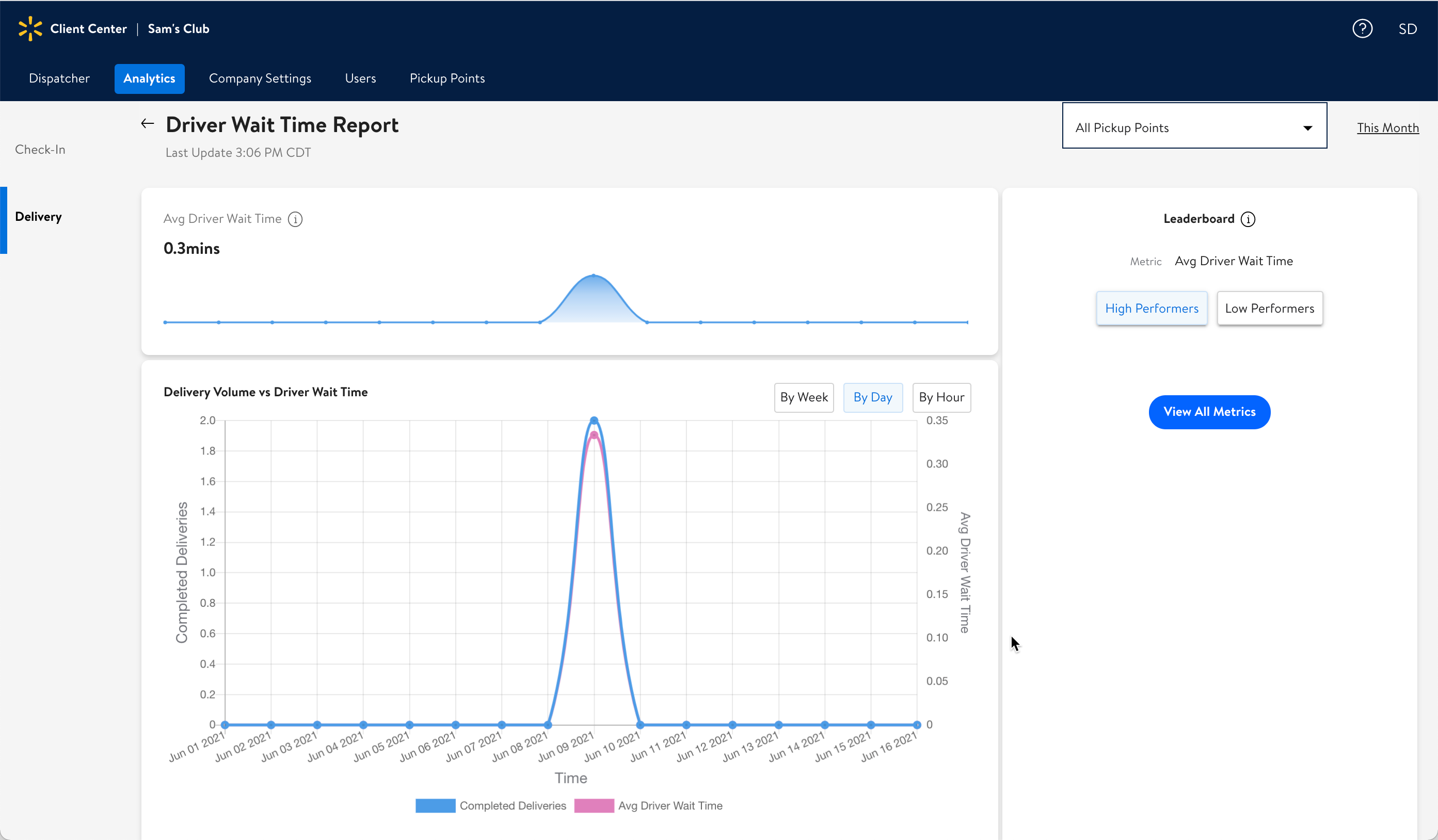
Completed Delivery Volume Graph
This graph shows the relationship between the number of completed deliveries and the average time a driver had to wait to load an order.
LeaderBoard
This board gives a quick look at how your Pickup Points are ranked based on selected metrics. Rankings are listed from 1st–onward (based on whether you select to see the highest or lowest performing Pickup Points).
High Performers
This shows a chronological ranking of Pickup Points that are performing the highest (best). For example, if a Pickup Point is ranked 1st, this means it's currently performing the most efficiently: this location is completing the greatest number of deliveries with the lowest amount of dwell time for drivers.
Low Performers
This shows a chronological ranking of Pickup Points that are performing the lowest (worst). For example, if a Pickup Point is ranked 1st, this means it is currently performing the least efficiently: this location is completing the lowest number of deliveries with the highest amount of dwell time for drivers.
Delivery Distribution Chart
This chart displays all delivery statuses for the date range specified. These statuses include:
In Progress Deliveries
Completed Deliveries
Returned Deliveries
Canceled Deliveries
How to Access the Delivery Dashboard
After you sign in to Client Center, select the Analytics tab. The Delivery Dashboard opens.
Note: Pickup Point employees only have access to view their Pickup Points, while admins are able to see all Pickup Points.
The Driver Wait Time Report
Here, you can find information about the average time a driver spends at a Pickup Point (this includes the time it takes for orders to be loaded into the driver's vehicle).
See the Driver Wait Time Report article for a complete breakdown of each section in this report.
The Metrics Summary Report
This report displays a summary of delivery metrics.
See the Metrics Summary Report article for a complete breakdown of the data points.
Actions
Select Pickup Points using the drop-down menu in the top-right corner of the dashboard or each report to choose which Pickup Points' data you'd like to include.
Select Date Range using the date range link found in the top-right corner of the dashboard or each report to filter data by dates.
Hover over any point on a graph, chart, or bell curve to see data for specific hours, days, or weeks.